
Data Visualization in Sports: Game Changing Insights
Let's start with a simple idea: turning a mountain of game stats into a clear, insightful picture. Data visualization in sports is really just the art of translating raw numbers, like player speeds or shot locations, into visuals like heatmaps and performance charts.
Think of it this way: raw data is the script for a movie, full of dialogue and scene descriptions. But a visualization is the movie itself. It tells the story of the game in a way everyone can immediately grasp.
What Is Data Visualization in Sports?
At its heart, sports data visualization takes those dense, complicated datasets and makes them intuitive. Instead of staring at a spreadsheet with hundreds of rows of player coordinates or pass completion percentages, you get a story told through charts, graphs, and interactive dashboards.
This is about moving beyond basic box scores to uncover the hidden patterns in team strategy and individual player performance that numbers alone just can't show you.
It’s this visual approach that makes complex information accessible to everyone. A coach can instantly see which areas of the field their team is most vulnerable. A scout can spot an undervalued player by looking at their performance trends over a season. Even a fan can understand exactly why a certain play succeeded or failed just by looking at a graphic. It’s all about making the data speak.
From Scorecards to Scatter Plots
This whole concept isn't exactly new. If you want to get technical, you could trace the roots of sports data visualization all the way back to the 1870s when Henry Chadwick introduced the first baseball scorecard. It was a revolutionary way to collect and show game stats beyond just the final score, and it really kicked off the whole field of systematic sports data collection.
Of course, things have grown a lot since then. Today, professionals who can interpret this data and build these visuals are in high demand from teams and media companies alike. If you're thinking about building a career in this space, you can often find a job in the sports industry by keeping an eye on specialized job boards.
This infographic gives a great breakdown of how the whole process works from start to finish.
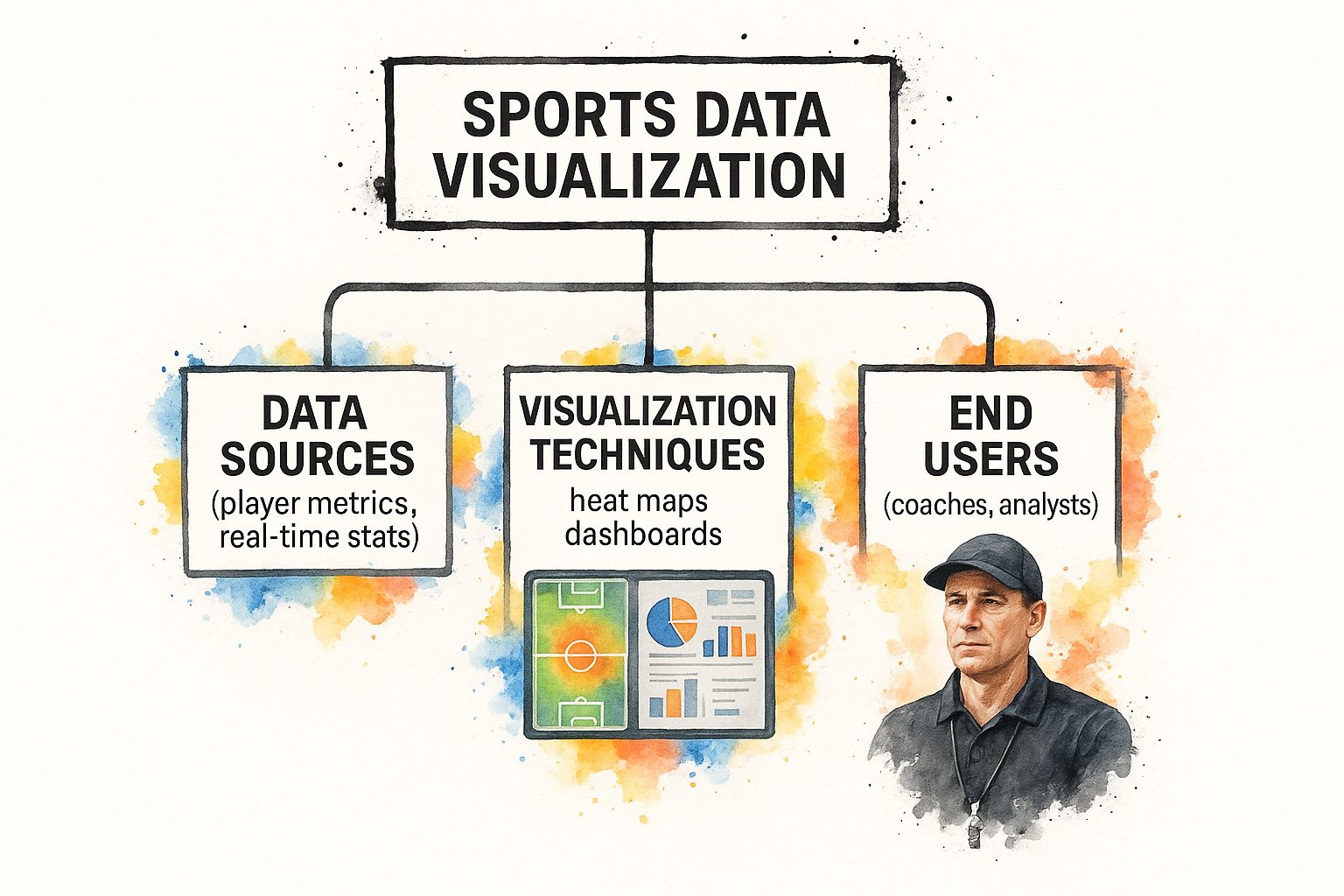
As you can see, it all starts with raw data from various sources. That data is then run through specific analytical techniques to create insights for people like coaches, analysts, and fans.
The Three Pillars of Sports Data
So, what kind of data are we actually talking about? It's not just one thing. The graphics you see during a broadcast or in a post-game breakdown are the final product of a deep analytical process. They help answer critical questions that raw numbers simply can't.
Data visualization gives sports professionals a common language. It allows a coach, a player, and a general manager to look at the same graphic and arrive at a shared understanding of what’s happening on the field or court.
To get this right, analysts rely on three key types of data.
Here’s a quick look at the main categories that fuel modern sports analytics.
Key Types of Data Used in Sports Visualization
| Data Type | Description | Example |
|---|---|---|
| Box-Score Data | The traditional, summary-level stats you're familiar with. They give a high-level overview of performance in a single game. | Points, assists, rebounds, goals, saves, batting average. |
| Tracking Data | Granular, moment-by-moment data captured by cameras and sensors. It tracks the real-time position of every player and the ball. | Player speed, distance covered, shot trajectories, defensive positioning. |
| Contextual Data | Information that adds context to the other data types, creating a complete picture of the game situation. | The score at a given moment, time remaining, down and distance, type of play called. |
By blending these three data types, analysts can create incredibly rich, layered visualizations that tell the full story of a game. Understanding this foundation is the first step to appreciating just how powerful these tools are, and how they're changing the face of sports.
Why Visuals Are a Game Changer in Sports
So, why bother turning a mountain of numbers into a bunch of pictures? It’s simple: it gives teams a serious competitive advantage. Visuals have a knack for revealing hidden trends and patterns that raw spreadsheets could never show, unlocking insights that can genuinely win games.
Just imagine trying to pinpoint a player’s exact moment of fatigue by staring at rows of speed data. It’s nearly impossible. But a simple line chart plotting their sprint speed over a match makes that drop-off immediately obvious. This is the real power of data visualization in sports, it transforms abstract numbers into actionable intelligence.
For teams and analysts, this isn't just about making data look pretty. It's about developing a deeper, more intuitive grasp of performance. The benefits are felt everywhere, from the front office right down to the sidelines.
Enhanced Strategic Planning
Coaches are always searching for an edge. Data visualization delivers it by exposing an opponent's weaknesses and highlighting opportunities in your own game plan. Instead of just relying on gut feelings, they can make crucial decisions backed by clear, visual evidence.
A soccer manager, for example, can use a pass map to instantly see which players are linking up effectively and which passing lanes are consistently getting shut down. That visual makes it painfully obvious where the team’s offensive flow is breaking down.
It's the same in basketball. A coach can pull up a shot chart to see exactly where the other team's star player is least efficient. This information directly shapes their defensive strategy, telling defenders precisely where to force that player to shoot from. These visuals make instant, game-winning adjustments possible in a way that raw stats just can't match.
By seeing how a team's defensive structure breaks down visually, coaches can make instant adjustments. It’s the difference between guessing where the problem is and knowing where it is.
The ability to build and interpret these strategic visuals is a massively sought-after skill. The sports industry is packed with opportunities for people who can connect data to what happens on the field. If turning this passion into a profession sounds interesting, you can start by checking out career opportunities on www.sportsjobs.online.
Smarter Player Development
Beyond team-level strategy, data visualization is absolutely critical for nurturing individual talent. It offers a detailed, objective look at a player's strengths, weaknesses, and progress over time, which helps coaches create personalized training plans that hit specific areas for improvement.
Think about a young quarterback. An analyst can whip up a dashboard showing his completion percentage based on the throw type, distance, and defensive pressure. Seeing this laid out visually might reveal he really struggles with deep throws when pressured from the left side. That’s a specific, correctable issue you can fix with a targeted training plan.
This approach works in pretty much every sport:
- Baseball: A hitting coach can use a spray chart to show a batter exactly where they're hitting the ball, helping them adjust their swing to beat defensive shifts.
- Tennis: Performance charts can track a player's first-serve percentage game-by-game, identifying dips in performance that are likely tied to fatigue.
- Swimming: Stroke analysis visuals can break down every single phase of a swimmer's movement, pinpointing tiny inefficiencies that can shave precious seconds off their time.
If you enjoy the idea of shaping athlete performance through data, jobs in this field are growing fast. You can find roles that combine data skills and sports knowledge by visiting www.sportsjobs.online.
Creating a More Immersive Fan Experience
The impact of data visualization in sports goes far beyond the teams themselves. It has completely changed how fans watch and connect with the games they love. Broadcasters and media outlets now use graphics to tell richer, more compelling stories.
When you see a graphic showing a Formula 1 driver's tire degradation during a race, you suddenly get a much deeper appreciation for their pit-stop strategy. When a broadcast pops up a football team’s win probability as it swings with each play, it adds a whole new layer of drama to the game.
These visuals make complex ideas accessible and exciting for the average fan. This deeper engagement keeps people hooked and helps grow the sport. The skills needed to create these fan-facing graphics are incredibly valuable, and many people have built amazing careers in this niche. You might be interested in a Data Visualization Specialist role that focuses on bringing these exact kinds of stories to life.
Common Visualization Techniques in Sports
Alright, we've talked about why visuals are so important in sports. Now for the fun part: let's get our hands dirty and look at the actual techniques analysts use every single day. Think of these as the essential tools in the sports data toolkit.
These methods are what turn a mountain of raw, messy data into a story you can understand in a single glance. Whether you're a coach trying to find an edge, a scout evaluating talent, or a fan who just wants to see the game on a deeper level, these visuals cut through the noise.
Each technique has a specific job to do. Let’s break down the most common ones so the next time you see one on a broadcast, you'll know exactly what it’s telling you.
Heatmaps: Finding the "Hot Spots" on the Field
If you've ever seen a weather report, you already know how to read a heatmap. It’s one of the most powerful and intuitive visuals in sports analytics, using a simple color scale to show where the action is happening.
Red usually means “hot” or high activity, while blue means “cold” or low activity. A heatmap instantly reveals where a player or team spends the most time and has the biggest impact. For a soccer midfielder, you might see a bright red blob in the center of the pitch, showing exactly where they dominate the game.
This is gold for strategists. A basketball coach can pull up an opponent's shooting heatmap to see their go-to spots on the floor and then design a defense to shut them down.
Here’s a perfect example of a heatmap from a soccer match, showing where one player was most active.
You don’t need to be a data scientist to see the story here. The bright red and yellow zones make it obvious where this player lived during the game, giving you an immediate sense of their role and positioning.
Shot Charts and Pass Maps: Visualizing Key Actions
While heatmaps show general presence, sometimes you need to get more specific. That’s where shot charts and pass maps come in. They focus on concrete actions and their outcomes.
Shot Charts: A staple in basketball and hockey, these are basically diagrams of the playing surface with a dot for every shot taken. Different colors or symbols show makes versus misses. In seconds, you can see if a player is lethal from the three-point line but struggles in the paint. It's a clear, honest picture of shooting performance.
Pass Maps: Crucial for flow-based sports like soccer or American football, these diagrams trace how the ball moves between teammates. Lines connect players who complete passes, and thicker lines often represent a high-frequency connection. Coaches use this to spot their team’s go-to passing lanes and, just as importantly, to see which players might be getting frozen out of the offense.
These charts add another layer of detail, answering not just where but also what happened and how well. The ability to build and interpret these visuals is a core skill for any serious analyst. If this kind of work excites you, there are specialized roles out there, like this Soccer Data Scientist position, where you can turn that passion into a career.
Line Graphs: Tracking Performance Over Time
Not all sports stories are about location; many are about timing and endurance. When you want to see how performance changes over time, the simple line graph is your best friend. It’s perfect for tracking metrics from one minute, lap, or game to the next.
A line graph’s true power is in revealing trends. It connects the dots to show momentum, consistency, or the exact moment fatigue starts to set in.
Think about a Formula 1 team. They live and die by line graphs, poring over data that tracks lap times, tire wear, and fuel consumption. A quick look at a graph can show precisely which corner is costing their driver a tenth of a second. In baseball, a line graph tracking a pitcher’s fastball velocity across nine innings can tell a manager exactly when it’s time to go to the bullpen.
This technique is incredibly versatile. You can use it for a marathon runner's pace, a tennis player's first-serve percentage throughout a tournament, or a team's offensive efficiency from quarter to quarter. It’s yet another way that data visualization transforms raw numbers into a compelling, easy-to-understand narrative.
How Data Visualization Drives Real World Success

Theory is one thing, but the real magic of data visualization in sports happens when you see it drive actual wins. These techniques aren't just for making slick graphics for a presentation. They are practical, powerful tools that teams lean on every single day to get a real, measurable edge over the competition.
So, let's step away from the abstract concepts and jump into some stories from the field. These real-world examples show exactly how visual analysis can pinpoint problems, reshape strategies, and ultimately change outcomes on the biggest stages.
Perfecting Defense in the NBA
Picture an NBA coaching staff pulling their hair out over defensive mistakes. They know they're giving up too many easy looks, but a standard box score doesn’t tell them why. This is where data visualization completely changes the game.
Using player tracking data, which logs the precise court position of every player multiple times a second, analysts can build animated visuals of defensive possessions. Suddenly, coaches aren't just seeing that an opponent scored; they’re watching a replay of exactly how their defensive formation broke down.
They might spot a specific player who is consistently a half-second too slow on a rotation, leaving a shooter wide open. Or maybe a heatmap of opponent shots reveals a glaring red "hot spot" just outside the key, showing that the team's entire pick-and-roll coverage is fundamentally flawed.
Armed with that kind of undeniable visual proof, coaches can run hyper-specific drills to fix that exact error. They're no longer just shouting "play better defense!", they're showing players a video of the problem and coaching them through the correction. This turns a mountain of data into concrete, game-winning adjustments.
Uncovering Hidden Gems in Soccer Scouting
In the high-stakes world of pro soccer, finding undervalued talent is how you build a championship team without a blank check. A Premier League club might need a new midfielder but can't afford the market's biggest names. This is where scouting dashboards become a scout's best friend.
Analysts and scouts create interactive dashboards to compare hundreds of players across dozens of metrics. Instead of just looking at goals and assists, they can see a player’s true impact through much richer visuals:
- Progressive Pass Maps: Which players consistently advance the ball into dangerous attacking zones?
- Defensive Action Heatmaps: Who is best at winning the ball back, and where on the pitch are they most effective?
- Expected Goals (xG) Charts: Which strikers are masters at getting into prime scoring positions, even if they've had a run of bad luck?
With these tools, a club might discover a player in a smaller league with elite-level passing stats who is completely overlooked because his team is struggling. The visualization makes his talent jump off the screen in a way raw numbers never could. This is how teams find bargains and build a competitive edge with smarter, more objective recruiting.
Visualization helps scouts see beyond a player's reputation and focus on their actual, on-field production. It separates the signal from the noise, leading to smarter signings and fewer expensive mistakes.
The roles that combine this deep sports knowledge with data skills are growing like crazy. If these stories of discovery and strategy fire you up, you can explore analyst and sports science positions on Sportsjobs Online to start building your own success story.
Transforming In-Game Strategy
As of the early 2020s, the fusion of data visualization and sports analytics became a non-negotiable part of strategic decision-making in top leagues like the NBA and Premier League. The ability to see performance trends in real-time is a massive advantage.
For instance, coaches use live dashboards, heatmaps, and small multiples charts right on the sideline to track metrics like shooting efficiency or defensive effectiveness as the game unfolds. This directly shapes their in-game tactics and player substitutions.
This real-time capability is where visualization truly becomes a coach's second brain. An F1 race engineer can watch a live graph of tire degradation and tell their driver exactly when to push for two more laps before pitting, a call that could win the race. A baseball manager can see a pitcher’s release point start to drop on a chart, a clear visual cue of fatigue, and get a reliever warming up before the game gets away from them.
These examples prove that data visualization isn't just for post-game reports. It’s an essential weapon for winning in the moment.
The Future of Sports Data Visualization
The world of sports analytics is moving at a breakneck pace. What seems like a scene from a sci-fi movie today can quickly become standard practice on the field tomorrow. The future of data visualization in sports isn't just about showing what already happened; it’s about predicting what’s going to happen next.
We're standing on the edge of some truly exciting developments that will completely change how teams prep, how coaches strategize, and how you and I experience the game. The graphics and charts we see today are really just the beginning.
The next wave of innovation will be fueled by powerful tech that makes today's heatmaps and shot charts look like something out of a history book. Imagine a world where data doesn't just describe the past but actively shapes the future in real-time. That's exactly where we're headed.
This forward-looking view shows the data revolution in sports is just getting started. If you want a job in the fast-growing sports tech industry, a great place to begin your search is at www.sportsjobs.online.
AI and Predictive Visuals
One of the biggest game-changers is the increasing role of artificial intelligence (AI) and machine learning. These aren't just for number-crunching anymore; they're creating predictive visuals. Instead of just showing you where a player shot from, future systems will show you the probability of that shot going in before it even leaves their hands.
Think about a quarterback dropping back to pass. In a split second, AI could analyze the defensive formation, the receivers' routes, and tons of historical data to generate a real-time graphic showing the likelihood of success for each passing option. For a coach, that's like having a crystal ball.
These predictive models can be used everywhere:
- Injury Prevention: Dashboards could flag players at high risk of injury by analyzing their movement patterns and workload. This allows teams to step in and rest them before a problem occurs.
- Play Calling: In baseball, a system could visualize the pitch sequence most likely to fool a specific batter based on all their past at-bats.
- Game Simulation: Teams could run thousands of game simulations with different lineups and strategies, all visualized to show which approach gives them the best shot at winning.
The Rise of Augmented and Virtual Reality
The next frontier is breaking free from the 2D screen. Augmented reality (AR) and virtual reality (VR) are set to completely overhaul how coaches and players interact with data. This isn't a gimmick, it's about creating truly immersive analytical experiences.
Imagine a coach putting on a VR headset and literally walking through a 3D replay of a critical play. They could see the action from any player's perspective, understanding exactly what they saw and why they made a specific decision. That's a level of insight a flat video replay can never hope to match.
With AR and VR, data becomes a physical space you can explore. A coach could literally stand on a virtual field and see defensive gaps open and close in three dimensions, making complex tactical concepts instantly clear.
AR could also overlay stats directly onto the field during practice. A quarterback might see a receiver's projected route highlighted in real time, or a basketball player could see the ideal shooting arc projected toward the hoop. Suddenly, every training session becomes a data-rich environment.
Personalized Fan Experiences
The future isn't just for the pros on the field. The way fans engage with sports is also about to get a major upgrade, all thanks to personalized data visualization. The one-size-fits-all broadcast is on its way out, and in its place are experiences you can shape to your own interests.
Soon, you'll be able to fire up custom dashboards tracking your favorite players' stats in real time during a live game. Fantasy sports players will be in heaven, watching their team's points update with every single play, visualized exactly the way they want.
This trend is all about giving you more control. You might choose to watch a soccer match with live heatmaps of your favorite midfielder overlaid on the screen or see a pitcher's running pitch count and velocity right next to the action. It's about turning passive viewing into an interactive, data-driven experience that puts you in the analyst's chair.
Future Trends in Sports Visualization
Looking ahead, several emerging technologies are poised to reshape the landscape. The table below outlines some key trends and how they might be applied in the world of sports.
| Technology Trend | Potential Application in Sports | Expected Benefit |
|---|---|---|
| Generative AI | Auto-generating visual playbooks and opponent scout reports. | Drastically reduces manual analysis time for coaching staff. |
| Wearable Sensor Fusion | Combining data from multiple sensors (GPS, accelerometers, heart rate) into a single, cohesive 3D player avatar. | Provides a holistic, real-time view of player performance and physiological stress. |
| Interactive Holograms | Projecting 3D replays onto a tabletop for tactical briefings. | Allows for collaborative, intuitive analysis of complex plays from any angle. |
| Real-Time Edge Computing | Processing player tracking data on-site for instant visual feedback during practice. | Eliminates lag, enabling immediate adjustments to technique and strategy. |
These innovations promise not just better graphics, but smarter, more intuitive ways to understand and interact with the game. The goal is to move beyond simply presenting data to creating experiences that provide deep, actionable insights for everyone from coaches to the fans at home.
Telling the Modern Sports Story
Throughout this guide, we've seen how visual design can give numbers a powerful voice. The whole idea behind data visualization in sports is to take overwhelming streams of stats and turn them into something clear, actionable intelligence for a team or captivating content for fans at home. It’s pretty simple, really: visuals tell stories that spreadsheets never could.
These visual stories aren't just a nice-to-have anymore. Whether you're in a front office making multi-million dollar decisions or on your couch trying to figure out the game, understanding these narratives is becoming critical. The skill of glancing at a chart and instantly getting the point is what connects everyone in the game today.
The Bridge Between Data and Action
When it comes down to it, data visualization is the essential bridge between raw numbers and doing something meaningful with them. It’s what lets a coach spot a defensive weakness, a scout see an athlete's hidden potential, or a broadcaster explain a complex play to millions.
All the techniques we've talked about, from simple heatmaps to complex predictive models, share one common goal: making data easy to understand and actually use. They pull back the curtain on the patterns, trends, and outliers that truly drive performance. Without clear visuals, even the best analytics would just stay locked away in a database, useless to the people who need them most.
Data visualization isn't just about showing what happened. It’s about explaining why it happened and inspiring smarter questions about what should happen next. This is the foundation of modern sports strategy.
Your Future in the Game
As sports get more and more data-driven, the demand for people who can build this bridge is exploding. There are some incredible career opportunities popping up for anyone who can connect the dots between the numbers on a screen and the action on the field. These aren't just jobs; they are roles that are fundamentally changing how we see and appreciate sports.
If you have a passion for sports and a knack for making sense of information, you're in a great spot. Teams, media outlets, and tech startups are all hunting for talent. If you feel inspired to turn this interest into a real career, you should check out the exciting opportunities waiting for you at www.sportsjobs.online. Your ability to tell these modern sports stories could be your ticket to a dream job in the industry.
Still Have Questions?
Let's tackle some of the practical questions that might be rattling around in your head. I want to give you some clear, direct answers to fill in any gaps and make sure you have a solid foundation to build on.
What Tools Are the Pros Actually Using for Sports Viz?
It really depends on the job at hand. For quickly building and sharing interactive dashboards, tools like Tableau or Microsoft Power BI are king. They let analysts create dynamic, slick-looking visuals without having to write a ton of code, which is a huge time-saver.
But when you need something highly customized or complex, you'll see analysts roll up their sleeves and fire up a programming language. Python, with its workhorse libraries like Matplotlib and Seaborn, is a massive favorite. R, especially with its ggplot2 package, is another go-to choice in the analytics community. These coding tools give you ultimate control to create anything you can imagine, from intricate player tracking maps to advanced statistical charts that can handle mountains of data.
How Can I Get Started in Sports Analytics?
Honestly, it's easier to jump in than you might think. A fantastic first step is to just immerse yourself. Follow sports analytics blogs and find the pros on social media to see what they're talking about and the kind of work they're producing.
To get your hands dirty, grab some free public sports data from a site like Kaggle. Start simple. Try building a basic shot chart in Google Sheets or Excel to get a feel for the core principles. From there, you can move on to free tools like Tableau Public or find beginner tutorials for Python or R that are geared specifically toward sports data. Marrying your passion for the game with these technical skills is the perfect recipe for getting started.
Is This Stuff Only for the Big Pro Teams?
Not a chance. While pro teams are obviously all-in on this for high-stakes decisions, data viz is trickling down to all levels, including college and even high school sports. The core idea of finding patterns to improve performance works no matter what league you're in.
In fact, one of the biggest consumers of data visualization in sports is you, the fan. TV broadcasts, sports media sites, and fantasy platforms all use graphics to make the game more compelling and easier to follow. It enriches the experience for everyone, not just the folks in the front office. Seeing these visuals out in the wild is also great inspiration for your own projects. And if you're hoping to turn that passion into a career, you can find your next opportunity at www.sportsjobs.online.
Hundreds of jobs are waiting for you!
Subscribe to membership and unlock all jobs
Sports Analytics
We scan all major sports and leagues
Updated Daily
New jobs are added every day as companies post them
Refined Search
Use filters like skill, location, etc to narrow results
Alerts
You can get daily alerts in your email for a specific search
Monthly
$6.99
per month
✓ Flexible monthly billing
✓ Unlimited access to all jobs
✓ Advanced filtering tools
✓ Exclusive discount codes
✓ Cancel anytime
BEST VALUE
Yearly
$39
per year • Only $3.25/mo
✓ Save 50% vs monthly
✓ Unlimited access to all jobs
✓ Advanced filtering tools
✓ Exclusive discount codes
✓ Cancel anytime
Lifetime
$59
one-time • forever
✓ Pay once, access forever
✓ Unlimited access to all jobs
✓ Advanced filtering tools
✓ Exclusive discount codes
✓ Best long-term value